pacman::p_load(ggdist, ggridges, ggthemes,
               colorspace, tidyverse, knitr,
               geomtextpath, ggtext, nord
)Hands-on Exercise 4a: Visualising Distribution
1 Learning Outcome
Visualising distribution is not new in statistical analysis. In chapter 1 we have shared with you some of the popular statistical graphics methods for visualising distribution are histogram, probability density curve (pdf), boxplot, notch plot and violin plot and how they can be created by using ggplot2. In this chapter, we are going to share with you two relatively new statistical graphic methods for visualising distribution, namely ridgeline plot and raincloud plot by using ggplot2 and its extensions.
2 Getting Started
Use the pacman package to check, install and launch the following R packages:
tidyverse, a family of R packages for data science process,
ggridges, a ggplot2 extension specially designed for plotting ridgeline plots,
ggdist for visualising distribution and uncertainty,
geomtextpath and ggtext for plots labels and annotations.
In this section, Exam_data.csv provided will be used. Using read_csv() of readr package, import Exam_data.csv into R.
The code chunk below read_csv() of readr package is used to import Exam_data.csv data file into R and save it as an tibble data frame called exam_data.
exam <- read_csv("data/Exam_data.csv")There are 322 observations across 7 attributes.
# A tibble: 5 × 7
  ID         CLASS GENDER RACE    ENGLISH MATHS SCIENCE
  <chr>      <chr> <chr>  <chr>     <dbl> <dbl>   <dbl>
1 Student321 3I    Male   Malay        21     9      15
2 Student305 3I    Female Malay        24    22      16
3 Student289 3H    Male   Chinese      26    16      16
4 Student227 3F    Male   Chinese      27    77      31
5 Student318 3I Male Malay 27 11 25glimpse(exam)Rows: 322
Columns: 7
$ ID <chr> "Student321", "Student305", "Student289", "Student227", "Stude…
$ CLASS <chr> "3I", "3I", "3H", "3F", "3I", "3I", "3I", "3I", "3I", "3H", "3…
$ GENDER <chr> "Male", "Female", "Male", "Male", "Male", "Female", "Male", "M…
$ RACE <chr> "Malay", "Malay", "Chinese", "Chinese", "Malay", "Malay", "Chi…
$ ENGLISH <dbl> 21, 24, 26, 27, 27, 31, 31, 31, 33, 34, 34, 36, 36, 36, 37, 38…
$ MATHS <dbl> 9, 22, 16, 77, 11, 16, 21, 18, 19, 49, 39, 35, 23, 36, 49, 30,…
$ SCIENCE <dbl> 15, 16, 16, 31, 25, 16, 25, 27, 15, 37, 42, 22, 32, 36, 35, 45…summary(exam) ID CLASS GENDER RACE
Length:322 Length:322 Length:322 Length:322
Class :character Class :character Class :character Class :character
Mode :character Mode :character Mode :character Mode :character
ENGLISH MATHS SCIENCE
Min. :21.00 Min. : 9.00 Min. :15.00
1st Qu.:59.00 1st Qu.:58.00 1st Qu.:49.25
Median :70.00 Median :74.00 Median :65.00
Mean :67.18 Mean :69.33 Mean :61.16
3rd Qu.:78.00 3rd Qu.:85.00 3rd Qu.:74.75
Max. :96.00 Max. :99.00 Max. :96.00 col <- c("CLASS", "GENDER", "RACE")
exam <- exam %>%
mutate(across(col, as.factor)) %>%
mutate(ID = as.character(ID))3 Visualising Distribution with Ridgeline Plot
Ridgeline plot (sometimes called Joyplot) is a data visualisation technique for revealing the distribution of a numeric value for several groups. Distribution can be represented using histograms or density plots, all aligned to the same horizontal scale and presented with a slight overlap.
Ridgeline plots make sense when the number of group to represent is medium to high, and thus a classic window separation would take to much space. Indeed, the fact that groups overlap each other allows to use space more efficiently. If you have less than 5 groups, dealing with other distribution plots is probably better.
It works well when there is a clear pattern in the result, like if there is an obvious ranking in groups. Otherwise group will tend to overlap each other, leading to a messy plot not providing any insight.
3.1 Plotting ridgeline graph: ggridges method
There are several ways to plot ridgeline plot with R. In this section, we will learn how to plot ridgeline plot by using ggridges package.
ggridges package provides two main geom to plot gridgeline plots, they are: geom_ridgeline() and geom_density_ridges(). The former takes height values directly to draw the ridgelines, and the latter first estimates data densities and then draws those using ridgelines.
The ridgeline plot below is plotted by using geom_density_ridges().
3.1.1 geom_density_ridges
Show the code
ggplot(exam,
       aes(x = ENGLISH,
           y = CLASS)) +
  geom_density_ridges(
    scale = 3,
    rel_min_height = 0.01,
    bandwidth = 3.4,
    fill = lighten("#7097BB", .3),
    color = "white"
  ) +
  scale_x_continuous(
    name = "English grades",
    expand = c(0, 0)
    ) +
  scale_y_discrete(name = NULL, expand = expansion(add = c(0.2, 2.6))) +
  theme_ridges()+
  theme(
    #panel.grid.major = element_blank(),
    plot.background = element_rect(fill="#f5f5f5",colour="#f5f5f5")
    )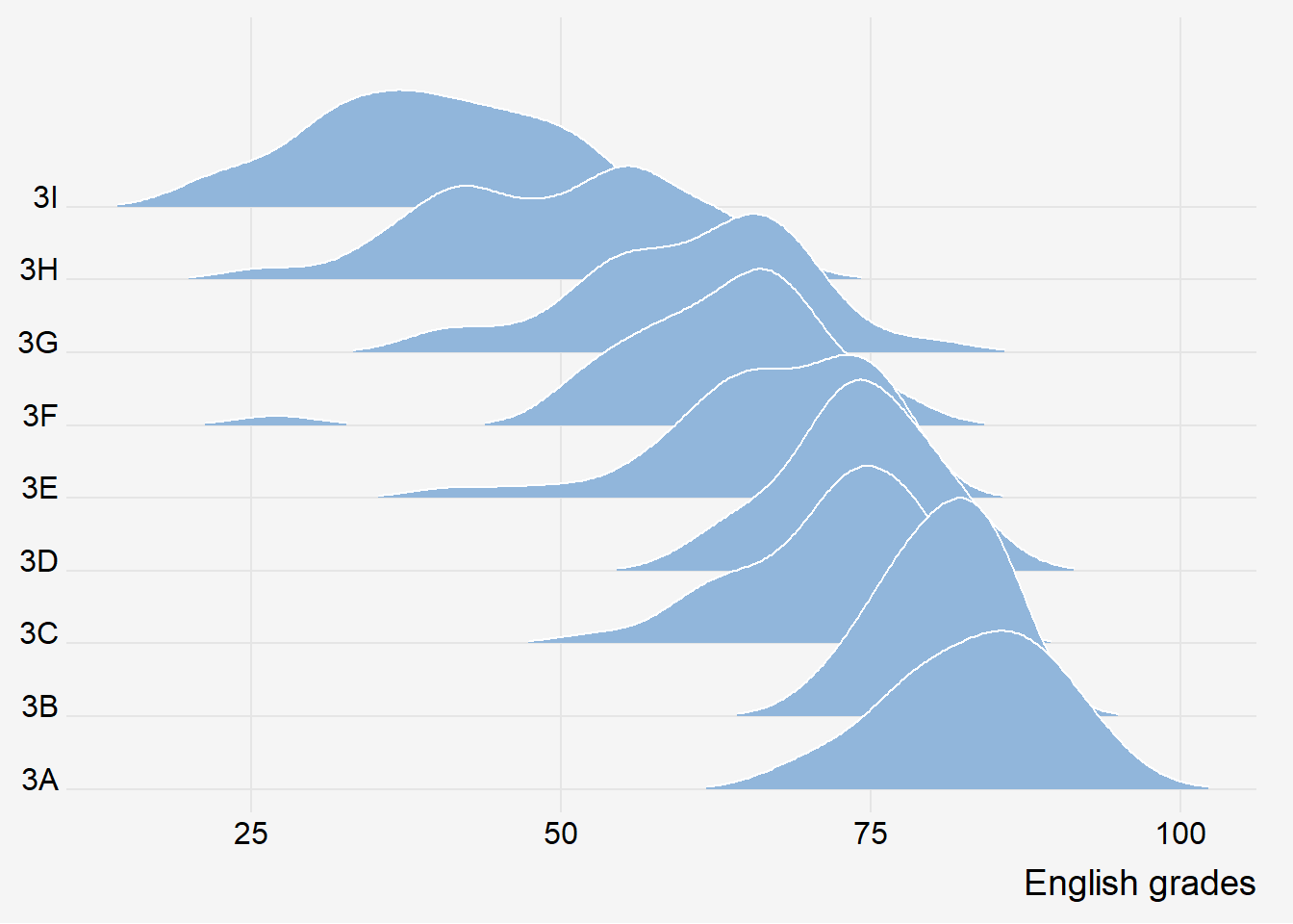
Insights:
- All density plots in 1 column to give the same context.
- Density plot for 3B narrower than 3A. 3A has bigger variability while students in 3B performs quite similarly.
- 3C and 3H have 2 humps.
3.2 Varying fill colors along the x axis
Sometimes we would like to have the area under a ridgeline not filled with a single solid color but rather with colors that vary in some form along the x axis. This effect can be achieved by using either geom_ridgeline_gradient() or geom_density_ridges_gradient(). Both geoms work just like geom_ridgeline() and geom_density_ridges(), except that they allow for varying fill colors. However, they do not allow for alpha transparency in the fill. For technical reasons, we can have changing fill colors or transparency but not both.
Show the code
ggplot(exam,
       aes(x = ENGLISH,
           y = CLASS,
           fill = stat(x))) +
  geom_density_ridges_gradient(
    scale = 3,
    rel_min_height = 0.01,
    color='#8da3ca',
    linewidth=1.05) +
  scale_color_continuous_sequential('Purple-Blue')+
  scale_fill_continuous_sequential('Purple-Blue', name='displ')+
  scale_x_continuous(
    expand = c(0, 0)
  ) +
  scale_y_discrete(name = NULL, expand = expansion(add = c(0.2, 2.6))) +
  theme_ridges()+
  labs(x = "English Score",
       y = "",
       title="Colour transition from light to dark as scores improve.") +
  theme(
    legend.position = "none",
    #panel.grid.major = element_blank(),
    axis.title.y = element_blank(),
    plot.background = element_rect(fill="#f5f5f5",colour="#f5f5f5")
) 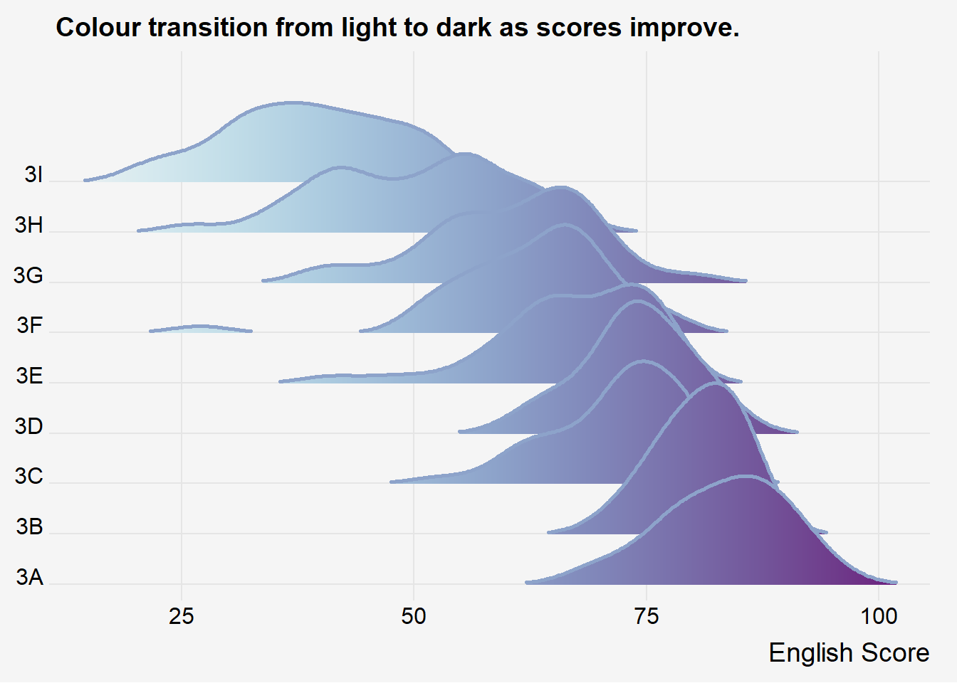
Observations:
- Colour intensity to represent range of scores.
- With facets, 1 legend for each facet so hard to compare across groups.
3.3 Mapping the probabilities directly onto colour
Beside providing additional geom objects to support the need to plot ridgeline plot, ggridges package also provides a stat function called stat_density_ridges() that replaces stat_density() of ggplot2.
Figure below is plotted by mapping the probabilities calculated by using stat(ecdf) which represent the empirical cumulative density function for the distribution of English score.
Show the code
ggplot(exam,
       aes(x = ENGLISH,
           y = CLASS,
           fill = 0.5 - abs(0.5-stat(ecdf)))) +
  stat_density_ridges(geom = "density_ridges_gradient",
                      calc_ecdf = TRUE) +
  scale_fill_viridis_c(name = "Tail probability",
                       direction = -1) +
  theme_ridges()+
  labs(x = "English",
       y = "",
       title="Uneven distribution across classes.") +
  theme(
    #legend.position = "none",
    #panel.grid.major = element_blank(),
    axis.title.y = element_blank(),
    plot.background = element_rect(fill="#f5f5f5",colour="#f5f5f5")
) 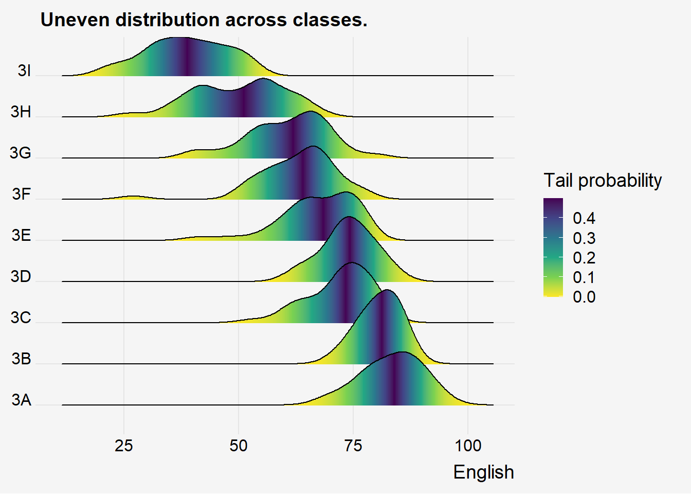
Insights:
- Colour intensity to represent percentile of values.
- Top 10% of 3A is doing better than 3B, but lower percentile of 3A and 3B are similar.
3.4 Ridgeline plots with quantile lines
Show the code
ggplot(exam,
       aes(x = ENGLISH,
           y = CLASS,
           fill = factor(stat(quantile))
           )) +
  stat_density_ridges(
    geom = "density_ridges_gradient",
    calc_ecdf = TRUE,
    quantiles = 4,
    quantile_lines = TRUE) +
  scale_fill_viridis_d(name = "Quartiles") +
  theme_ridges()+
  labs(x = "English",
       y = "",
       title="Uneven distribution across classes.") +
  theme(
    legend.position = "none",
    #panel.grid.major = element_blank(),
    axis.title.y = element_blank(),
    plot.background = element_rect(fill="#f5f5f5",colour="#f5f5f5")
) 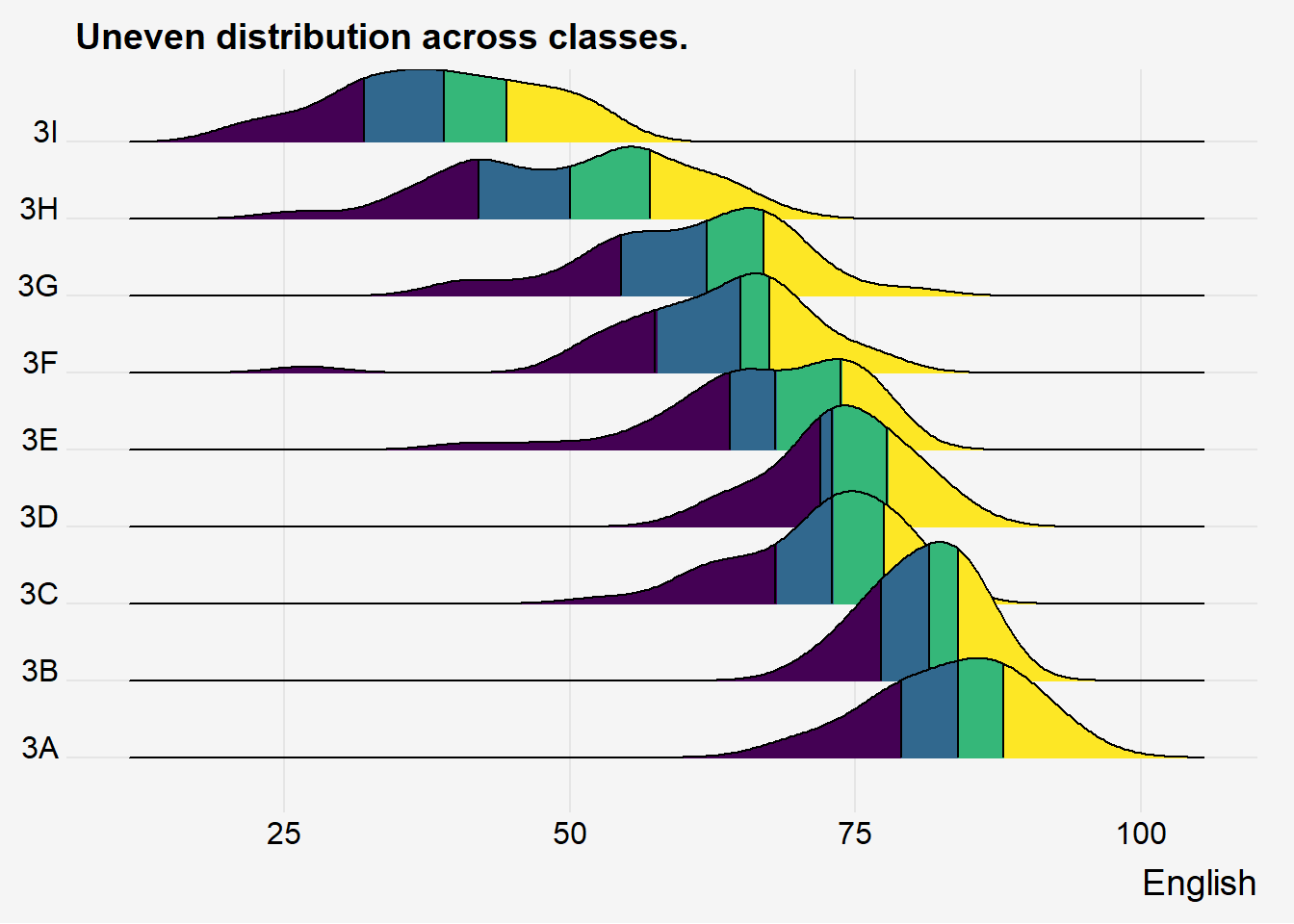
Instead of using number to define the quantiles, we can also specify quantiles by cut points such as 2.5% and 97.5% tails to colour the ridgeline plot as shown in the figure below.
Show the code
ggplot(exam,
       aes(x = ENGLISH,
           y = CLASS,
           fill = factor(stat(quantile))
           )) +
  stat_density_ridges(
    geom = "density_ridges_gradient",
    calc_ecdf = TRUE,
    quantiles = c(0.025, 0.975)
    ) +
  scale_fill_manual(
    name = "Probability",
    values = c("#FF0000A0", "#A0A0A0A0", "#0000FFA0"),
    labels = c("(0, 0.025]", "(0.025, 0.975]", "(0.975, 1]")
  ) +
  theme_ridges()+
  labs(x = "English",
       y = "",
       title="Uneven distribution across classes.") +
  theme(
    legend.position = "none",
    #panel.grid.major = element_blank(),
    axis.title.y = element_blank(),
    plot.background = element_rect(fill="#f5f5f5",colour="#f5f5f5")
) 
4 Visualising Distribution with Raincloud Plot
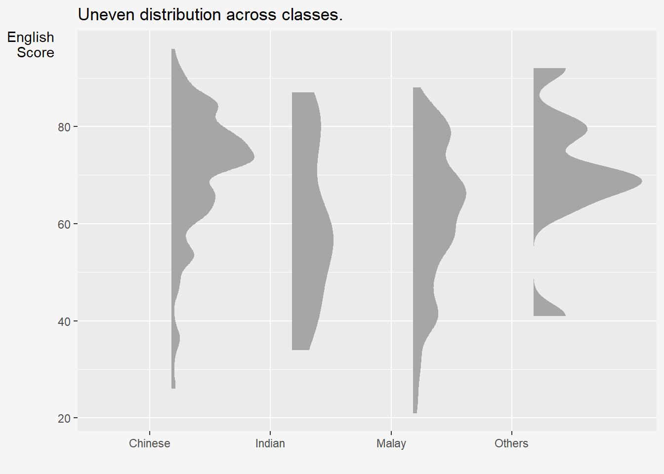
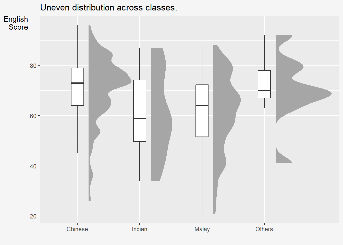
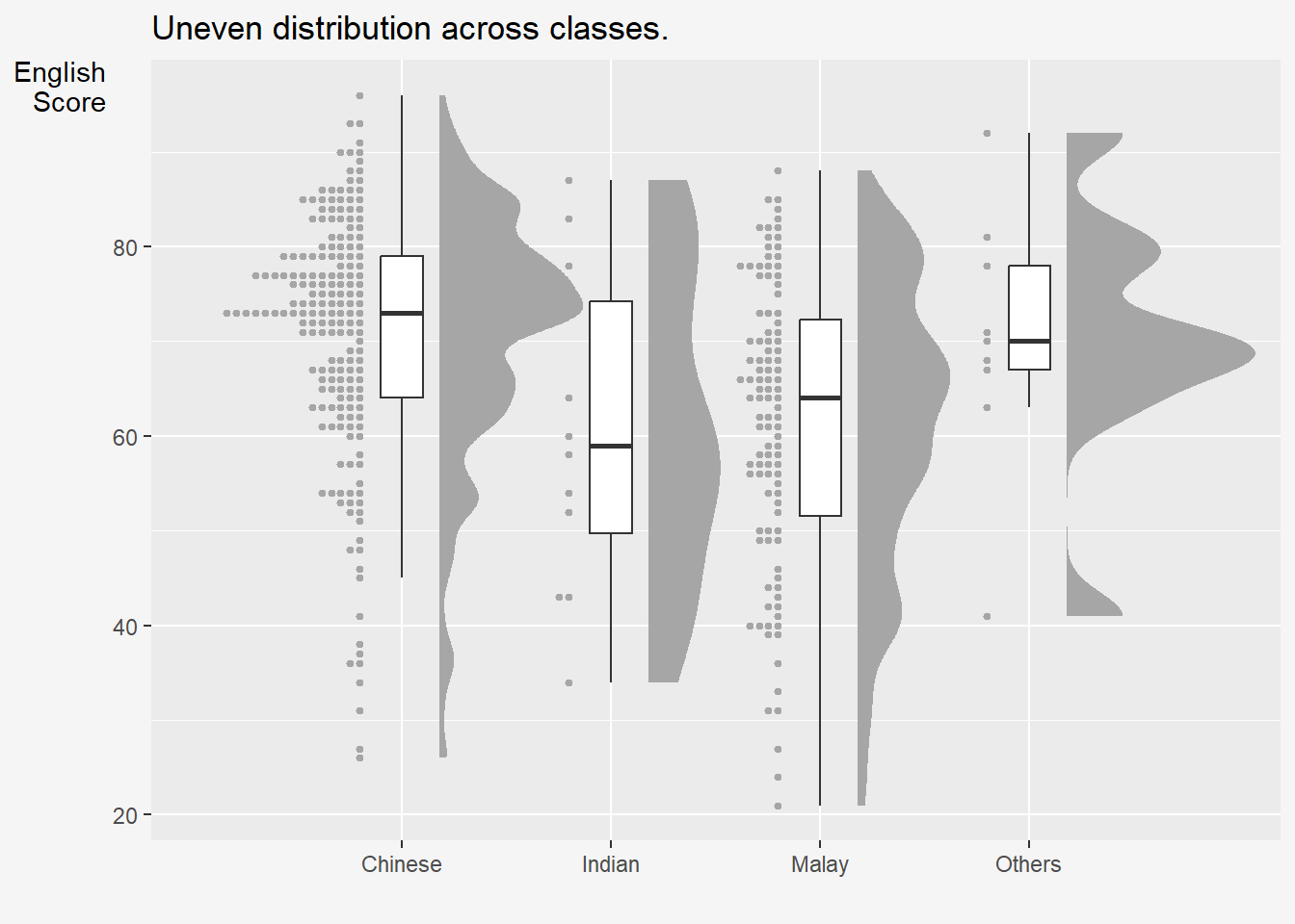
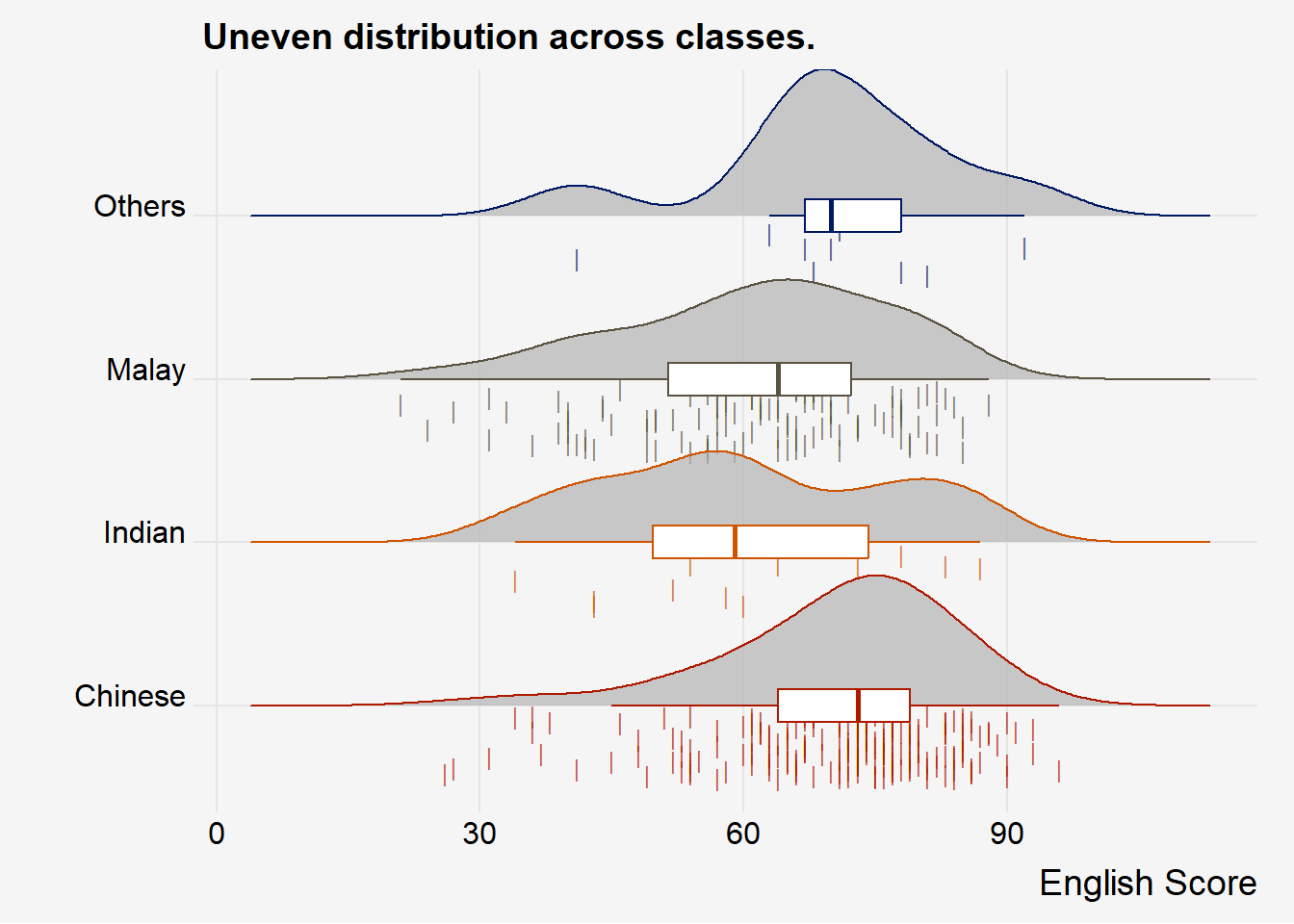
Raincloud Plot is a data visualisation techniques that produces a half-density to a distribution plot. It gets the name because the density plot is in the shape of a “raincloud”. The raincloud (half-density) plot enhances the traditional box-plot by highlighting multiple modalities (an indicator that groups may exist). The boxplot does not show where densities are clustered, but the raincloud plot does!
In this section, you will learn how to create a raincloud plot to visualise the distribution of English score by race. It will be created by using functions provided by ggdist and ggplot2 packages.
4.1 Plotting a Half Eye graph
First, we will plot a Half-Eye graph by using stat_halfeye() of ggdist package.
This produces a Half Eye visualization, which is contains a half-density and a slab-interval.
We remove the slab interval by setting .width = 0 and point_colour = NA.
Show the code
ggplot(exam,
       aes(x = RACE,
           y = ENGLISH)) +
  stat_halfeye(adjust = 0.5,
               justification = -0.2,
               .width = 0,
               point_colour = NA)+
  labs(x = "",
       y = "English\nScore",
       title="Uneven distribution across classes.") +
  theme(
    legend.position = "none",
    #panel.grid.major = element_blank(),
    axis.title.y = element_text(hjust=1, angle=0),
    plot.background = element_rect(fill="#f5f5f5",colour="#f5f5f5")
) 
4.2 Adding the boxplot with geom_boxplot()
Next, we will add the second geometry layer using geom_boxplot() of ggplot2. This produces a narrow boxplot. We reduce the width and adjust the opacity.
Show the code
ggplot(exam,
       aes(x = RACE,
           y = ENGLISH)) +
  stat_halfeye(adjust = 0.5,
               justification = -0.2,
               .width = 0,
               point_colour = NA) +
  geom_boxplot(width = .20,
               outlier.shape = NA) +
  labs(x = "",
       y = "English\nScore",
       title="Uneven distribution across classes.") +
  theme(
    legend.position = "none",
    #panel.grid.major = element_blank(),
    axis.title.y = element_text(hjust=1, angle=0),
    plot.background = element_rect(fill="#f5f5f5",colour="#f5f5f5")
) 
4.3 Adding the Dot Plots with stat_dots()
Next, we will add the third geometry layer using stat_dots() of ggdist package. This produces a half-dotplot, which is similar to a histogram that indicates the number of samples (number of dots) in each bin. We select side = “left” to indicate we want it on the left-hand side.
Show the code
ggplot(exam,
       aes(x = RACE,
           y = ENGLISH)) +
  stat_halfeye(adjust = 0.5,
               justification = -0.2,
               .width = 0,
               point_colour = NA) +
  geom_boxplot(width = .20,
               outlier.shape = NA) +
  stat_dots(side = "left",
            justification = 1.2,
            binwidth = .5,
            dotsize = 2) +
  labs(x = "",
       y = "English\nScore",
       title="Uneven distribution across classes.") +
  theme(
    legend.position = "none",
    #panel.grid.major = element_blank(),
    axis.title.y = element_text(hjust=1, angle=0),
    plot.background = element_rect(fill="#f5f5f5",colour="#f5f5f5")
) 
4.4 Finishing touch
Lastly, coord_flip() of ggplot2 package will be used to flip the raincloud chart horizontally to give it the raincloud appearance.
Show the code
ggplot(exam,
       aes(x = RACE,
           y = ENGLISH)) +
  stat_halfeye(adjust = 0.5,
               justification = -0.2,
               .width = 0,
               point_colour = NA) +
  geom_boxplot(width = .20,
               outlier.shape = NA) +
  stat_dots(side = "left",
            justification = 1.2,
            binwidth = .5,
            dotsize = 1.5) +
  labs(x = "",
       y = "English Score",
       title="Uneven distribution across classes.") +
  theme(
    legend.position = "none",
    #panel.grid.major = element_blank(),
    axis.title.y = element_text(hjust=1, angle=0),
    plot.background = element_rect(fill="#f5f5f5",colour="#f5f5f5")
    )  +

coord_flip() 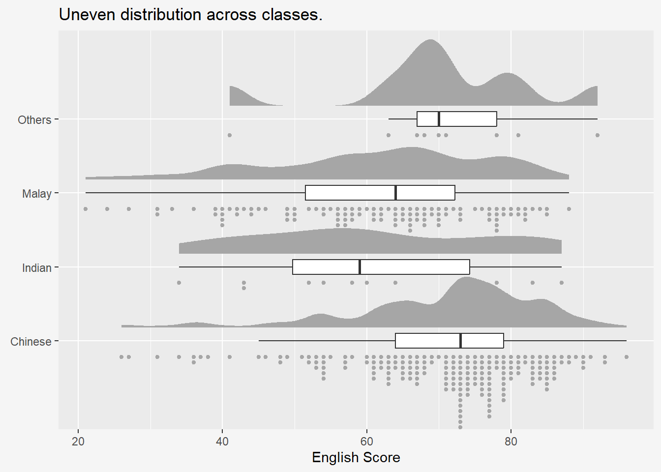
5 Raincloud plot with geom_density_ridges()
5.1 |-shaped jitters
Show the code
ggplot(exam,
       aes(x = ENGLISH,
           y = RACE,
           color=RACE,
           #fill=RACE
           )) +
  theme_ridges()+
  geom_density_ridges(jittered_points=TRUE,
                      position='raincloud',
                      alpha = 0.7,
                      scale=0.9,
                      point_shape = '|',
                      point_size = 3,
                      ) +
  geom_boxplot(width = .20,
               outlier.shape = NA) +
  scale_color_nord('victory_bonds')+
  scale_fill_nord('victory_bonds')+
  labs(x = "English Score",
       y = "",
       title="Uneven distribution across classes.") +
  theme(
    legend.position = "none",
    #panel.grid.major = element_blank(),
    axis.title.x = element_text(hjust=1, angle=0),
    plot.background = element_rect(fill="#f5f5f5",colour="#f5f5f5")
) 
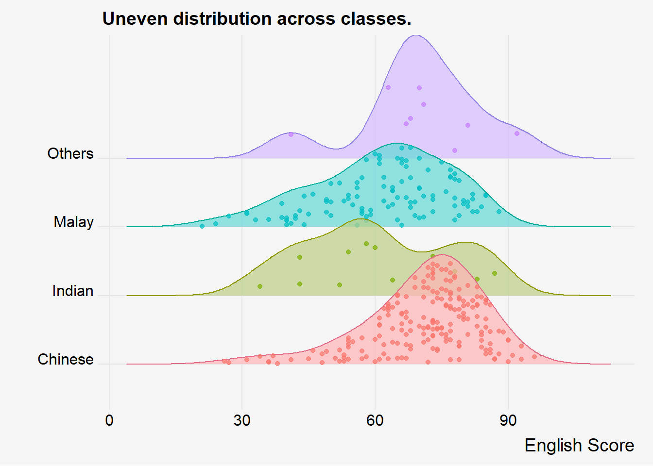
5.2 With Jittered Points
Show the code
ggplot(exam,
       aes(x = ENGLISH,
           y = RACE,
       color= RACE,
       fill= RACE)) +
  theme_ridges()+
  geom_density_ridges(jittered_points=TRUE,
                      aes(point_color=RACE),
                      alpha = 0.7,
                      point_size = 1.5,
                      ) +
  scale_fill_discrete_qualitative('Set 3')+
  scale_color_discrete_qualitative('Dark 3')+


  labs(x = "English Score",
       y = "",
       title="Uneven distribution across classes.") +
  theme(
    legend.position = "none",
    #panel.grid.major = element_blank(),
    axis.title.x = element_text(hjust=1, angle=0),
    plot.background = element_rect(fill="#f5f5f5",colour="#f5f5f5")
) 
6 Labelling density plots with geom_textdensity
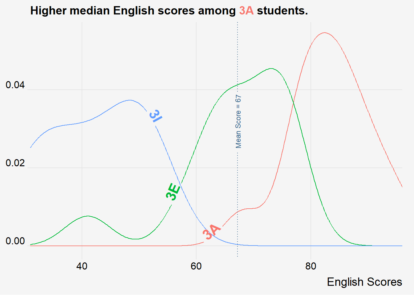
The attempt to recreate the original plot with geom_textdensity from the geom_textpath did not go all too well as the function does not take in a y value (i.e. it couldn’t arrange the plots along the y-axis. Rather, it was only able to lay out plots along a straight line). It looked much better when there are less groups.
geom_texthline and geom_textvline can also be used to plot reference lines.
Show the code
exam_3classes <- filter(exam, CLASS ==c("3A", "3E", "3I"))
mean_english <- mean(exam$ENGLISH)

ggplot(exam_3classes, aes(x = ENGLISH,
                 colour = CLASS,
                 label = CLASS,
                )) +
  geom_textdensity(
                   size = 6,
                   fontface = 2,
                   hjust = 0.3,
                   vjust = 0.1,
                   #linetype= 2 << For dotted line
                   ) +
  geom_textvline(aes(xintercept = mean_english,
                     label = paste0("Mean Score = ", round(mean_english, 0))),
                 color = "steelblue4",
                 linetype = "dotted",
                 linewidth = .5,
                 hjust = 0.6,
                 size = 3) +
  scale_x_continuous(
    expand = c(0, 0)
  ) +
  theme_ridges()+
  labs(x = "English Scores",
       y = "",
       title="Higher median English scores among <span style='color: #f8766d;'>3A</span> students.") +
  theme(
    legend.position = "none",
    #panel.grid.major = element_blank(),
    axis.title.y = element_blank(),
    axis.text.y = element_markdown(),
    plot.title = element_markdown(hjust=0),
    plot.background = element_rect(fill="#f5f5f5",colour="#f5f5f5") ,
    )
7 Tips
Controlling Parameters
scale: Larger scale = higher ridgeplots = more overlapsrel_min_height: Default = 0. Lines with height below this cutoff will be removed.heightrequired in ggridgeline but is interpolated in gg_density_ridges
8 Reference
- Kam, T.S. (2023). Visualising Distribution.