pacman::p_load(GGally, parallelPlot, tidyverse)Hands-on Exercise 5d: Visual Multivariate Analysis with Parallel Coordinates Plot
1 Overview
Parallel coordinates plot is a data visualisation specially designed for visualising and analysing multivariate, numerical data. It is ideal for comparing multiple quantitative variables together and seeing the relationships between them. Its strength is that the variables can even be completely different: different ranges and even different units.
2 Getting Starting
For this exercise, the GGally, parcoords, parallelPlot and tidyverse packages will be used.
In this hands-on exercise, the data of World Happiness 2018 report will be used. The original data set is in Microsoft Excel format. It has been extracted and saved in csv file called WHData-2018.csv.
wh <- read_csv("data/WHData-2018.csv")The output is a tibble data frame called wh, with 156 observations (rows) across 12 variables (columns).
glimpse(wh)Rows: 156
Columns: 12
$ Country <chr> "Albania", "Bosnia and Herzegovina", "B…
$ Region <chr> "Central and Eastern Europe", "Central …
$ `Happiness score` <dbl> 4.586, 5.129, 4.933, 5.321, 6.711, 5.73…
$ `Whisker-high` <dbl> 4.695, 5.224, 5.022, 5.398, 6.783, 5.81…
$ `Whisker-low` <dbl> 4.477, 5.035, 4.844, 5.244, 6.639, 5.66…
$ Dystopia <dbl> 1.462, 1.883, 1.219, 1.769, 2.494, 1.45…
$ `GDP per capita` <dbl> 0.916, 0.915, 1.054, 1.115, 1.233, 1.20…
$ `Social support` <dbl> 0.817, 1.078, 1.515, 1.161, 1.489, 1.53…
$ `Healthy life expectancy` <dbl> 0.790, 0.758, 0.712, 0.737, 0.854, 0.73…
$ `Freedom to make life choices` <dbl> 0.419, 0.280, 0.359, 0.380, 0.543, 0.55…
$ Generosity <dbl> 0.149, 0.216, 0.064, 0.120, 0.064, 0.08…
$ `Perceptions of corruption` <dbl> 0.032, 0.000, 0.009, 0.039, 0.034, 0.17…n_distinct(wh$Country)[1] 1562 Static Parallel Coordinates Plot
The code chunk below plots a basic parallel coordinate plot.
Show the code
ggparcoord(data = wh,
           columns = c(7:12)) +
  labs(title = "Basic Parallel Plot")+
    theme(
      plot.title = element_text(hjust=0, family = "Bold"),
      axis.title.x = element_blank(),
      axis.title.y = element_text(hjust=1, angle=0),
      plot.background = element_rect(fill = "#f5f5f5", color = "#f5f2f5"),
      legend.background = element_rect(fill="#f5f5f5"),
      panel.background = element_rect(fill="#f5f5f5"))  +
  scale_x_discrete(guide = guide_axis(n.dodge = 2))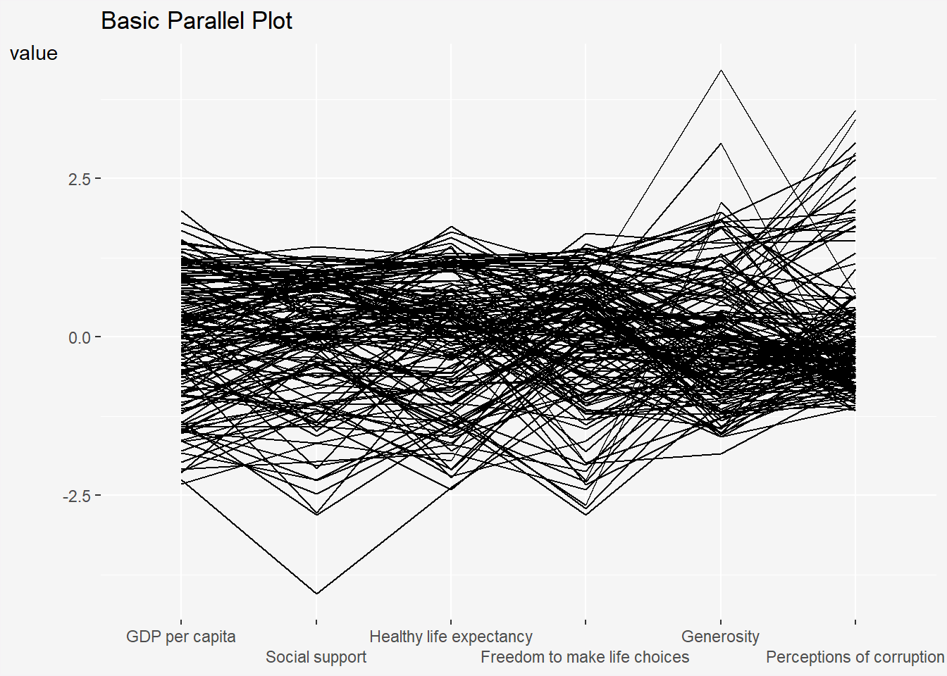
showPoints = TRUEand alphaLines = 0.3 are added to show individual observations and reduce opacity of the lines to reduce visual clutter.
Show the code
ggparcoord(data = wh,
           columns = c(7:12),
           showPoints = TRUE,
           alphaLines = 0.3) +
  labs(title = "Basic Parallel Plot with Points")+
    theme(
      plot.title = element_text(hjust=0, family = "Bold"),
      axis.title.x = element_blank(),
      axis.title.y = element_text(hjust=1, angle=0),
      plot.background = element_rect(fill = "#f5f5f5", color = "#f5f2f5"),
      legend.background = element_rect(fill="#f5f5f5"),
      panel.background = element_rect(fill="#f5f5f5"))  +
  scale_x_discrete(guide = guide_axis(n.dodge = 2))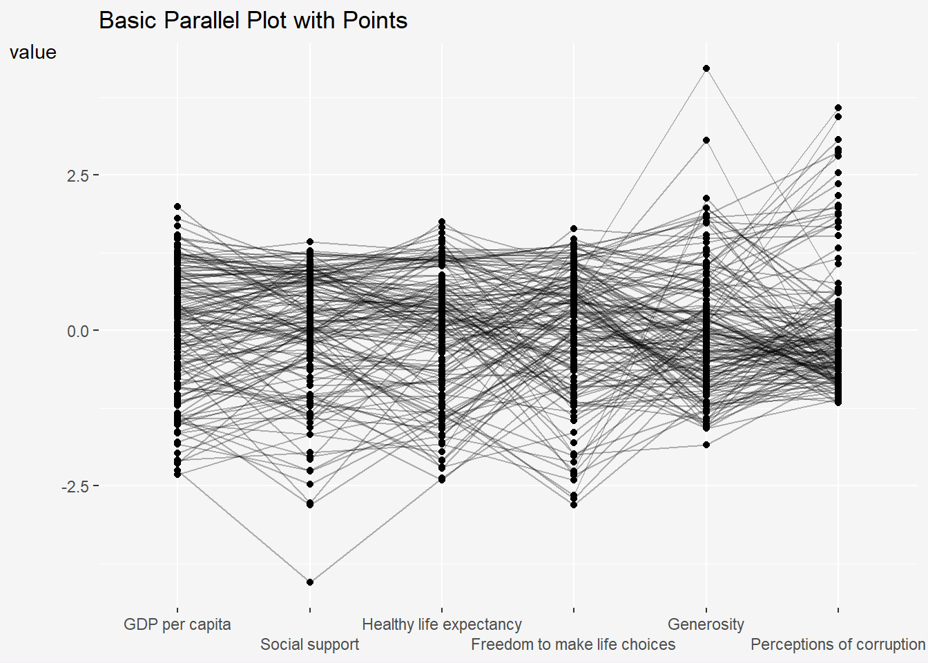
groupColumn = "Region" groups and colours the observations by their Region.
Show the code
ggparcoord(data = wh,
           columns = c(7:12),
           groupColumn = "Region") +
  labs(title = "Basic Parallel Plot, grouped by Region")+
    theme(
      plot.title = element_text(hjust=0, family = "Bold"),
      axis.title.x = element_blank(),
      axis.title.y = element_text(hjust=1, angle=0),
      legend.text = element_text(size=6),
      legend.key.width = unit(0.1, "cm"),
      legend.key.size = unit(0.1, "cm"),
      legend.position = "bottom",
      plot.background = element_rect(fill = "#f5f5f5", color = "#f5f2f5"),
      legend.background = element_rect(fill="#f5f5f5"),
      panel.background = element_rect(fill="#f5f5f5"))  +
  scale_x_discrete(guide = guide_axis(n.dodge = 2))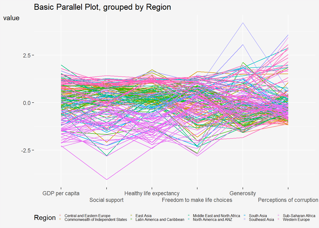
The highlighting effect is performed manually by assigning a highlight colour via scale_color_manual() to the group of interest, while muting the colours of the other groups in the backdrop.
Show the code
ggparcoord(data = wh,
           columns = c(7:12),
           groupColumn = "Region") +
  labs(title = "Basic Parallel Plot, highlighting a group")+
    theme(
      plot.title = element_text(hjust=0, family = "Bold"),
      axis.title.x = element_blank(),
      axis.title.y = element_text(hjust=1, angle=0),
      legend.text = element_text(size=6),
      legend.key.width = unit(0.1, "cm"),
      legend.key.size = unit(0.1, "cm"),
      legend.position = "bottom",
      plot.background = element_rect(fill = "#f5f5f5", color = "#f5f2f5"),
      legend.background = element_rect(fill="#f5f5f5"),
      panel.background = element_rect(fill="#f5f5f5"))  +
  scale_x_discrete(guide = guide_axis(n.dodge = 2))+
  scale_color_manual(values=c( "#E8E8E8", "#E8E8E8", "#E8E8E8", "#E8E8E8", "#E8E8E8", "#E8E8E8", "#E8E8E8", "#E8E8E8", "#E8E8E8", "#69b3a2") )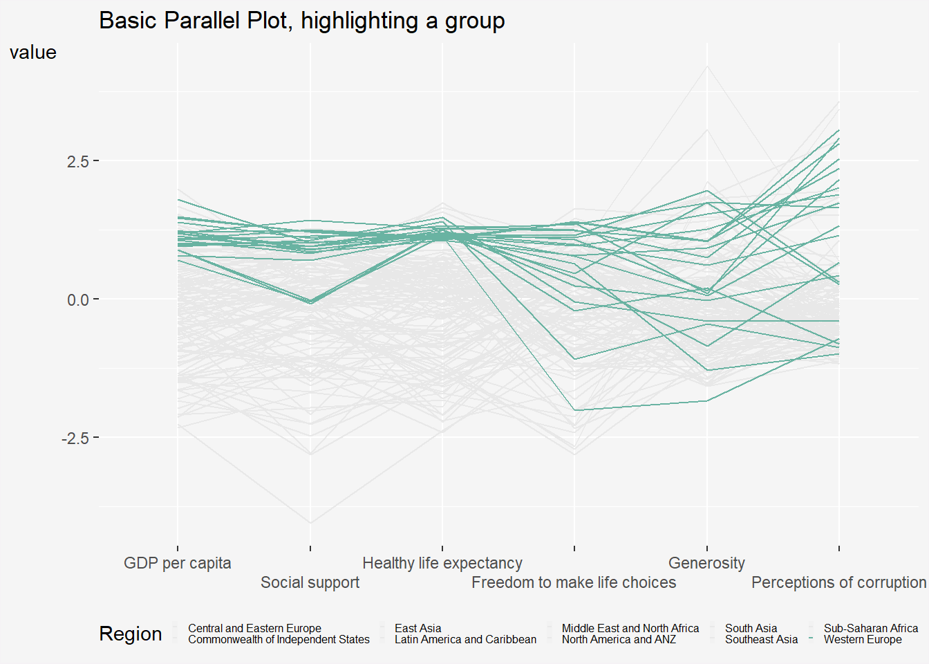
2.1 Parallel Coordinates with Boxplot
Show the code
ggparcoord(data = wh,
           columns = c(7:12),
           groupColumn = 2,
           scale = "uniminmax",
           alphaLines = 0.2,
           boxplot = TRUE,
           title = "Parallel Coordinates Plot of World Happines Variables") +
    theme(
      plot.title = element_text(hjust=0, family = "Bold"),
      axis.title.x = element_blank(),
      axis.title.y = element_text(hjust=1, angle=0),
      legend.text = element_text(size=6),
      legend.key.size = unit(1,"line"),
      plot.background = element_rect(fill = "#f5f5f5", color = "#f5f2f5"),
      legend.background = element_rect(fill="#f5f5f5"),
      panel.background = element_rect(fill="#f5f5f5"))  +
  scale_x_discrete(guide = guide_axis(n.dodge = 2))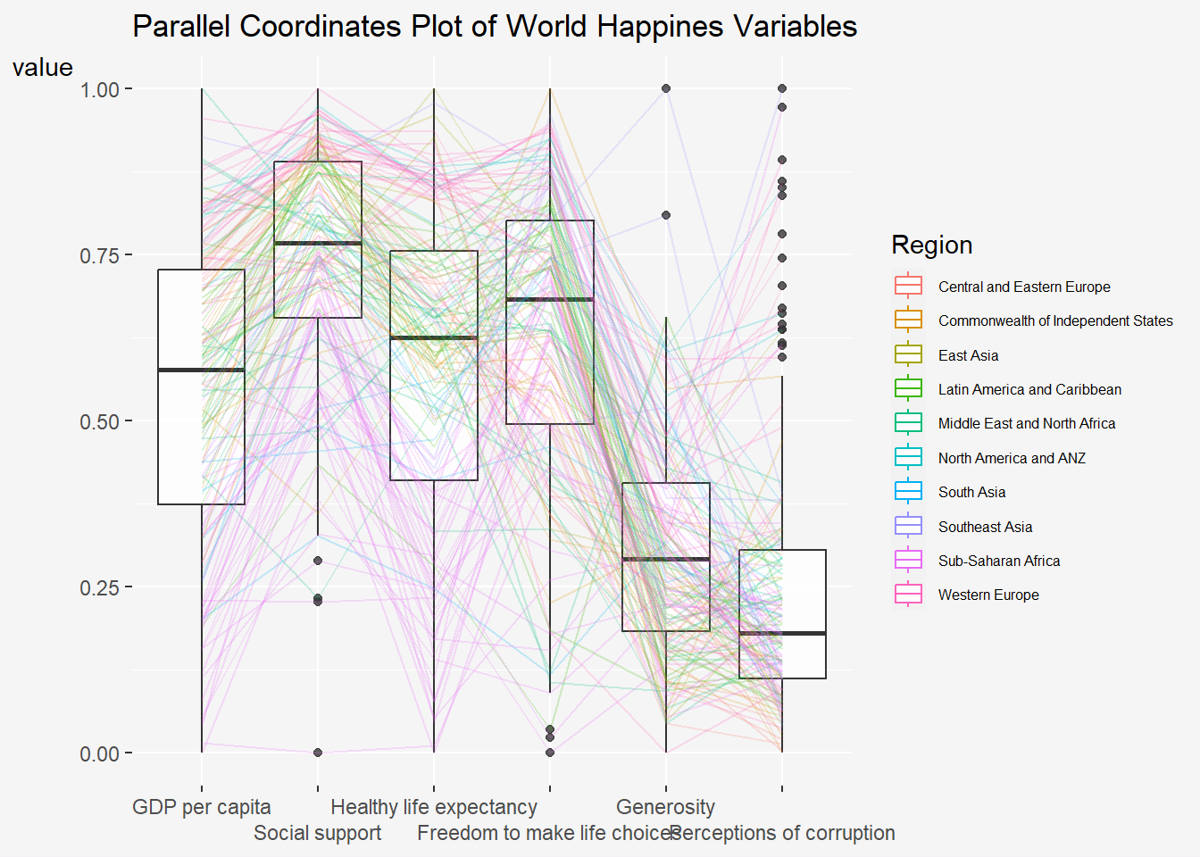
Things to learn from the code chunk above.
groupColumnargument is used to group the observations (i.e. parallel lines) by using a single variable (i.e. Region) and colour the parallel coordinates lines by region name.scaleargument is used to scale the variables in the parallel coordinate plot by usinguniminmaxmethod. The method univariately scale each variable so the minimum of the variable is zero and the maximum is one.alphaLinesargument is used to reduce the intensity of the line colour to 0.2. The permissible value range is between 0 to 1.boxplotargument is used to turn on the boxplot by using logicalTRUE. The default isFALSE.titleargument is used to provide the parallel coordinates plot a title.
2.2 Parallel coordinates with facet
Since ggparcoord() is developed by extending ggplot2 package, we can combination use some of the ggplot2 function when plotting a parallel coordinates plot.
In the code chunk below, facet_wrap() of ggplot2 is used to plot 10 small multiple parallel coordinates plots. Each plot represent one geographical region such as East Asia.
Show the code
ggparcoord(data = wh,
           columns = c(7:12),
           groupColumn = 2,
           scale = "uniminmax",
           alphaLines = 0.2,
           boxplot = TRUE,
           title = "Multiple Parallel Coordinates Plots of World Happines Variables by Region") +
  facet_wrap(~ Region, labeller = labeller(group = label_wrap_gen(width = 25))) +
    theme(
      plot.title = element_text(hjust=0, family = "Bold"),
      axis.title.x = element_blank(),
      axis.text.x = element_text(angle=30, hjust=1, size= 6),
      axis.title.y = element_blank(),
      strip.text = element_text(size = 8),
      legend.text = element_text(size=6),
      legend.key.width = unit(0.1, "cm"),
      legend.key.size = unit(0.1, "cm"),
      legend.position = "bottom",
      plot.background = element_rect(fill = "#f5f5f5", color = "#f5f2f5"),
      legend.background = element_rect(fill="#f5f5f5"),
panel.background = element_rect(fill="#f5f5f5")) 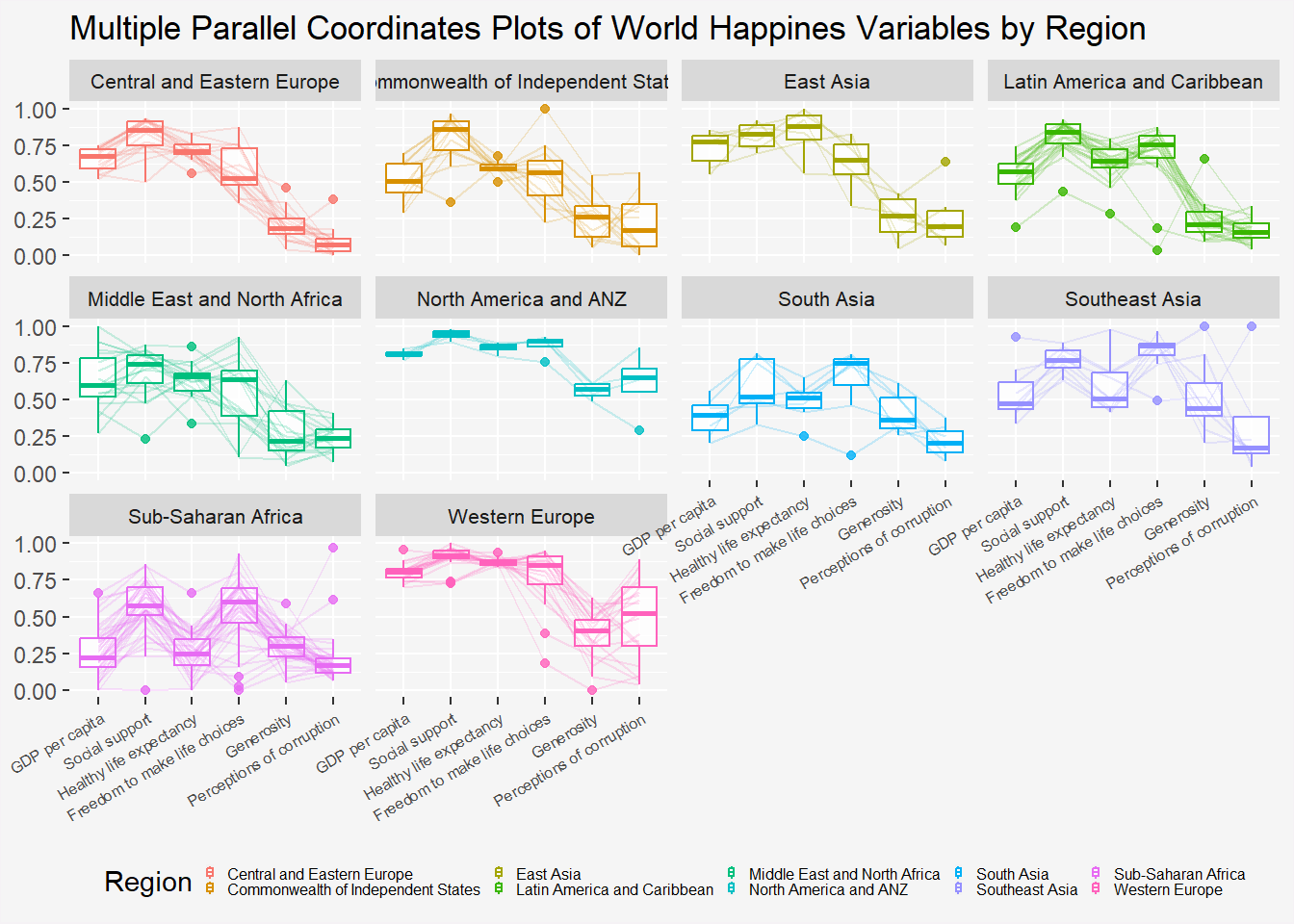
3 Interactive Parallel Coordinates Plot: parallelPlot methods
Show the code
wh <- wh %>%
  select("Happiness score", c(7:12))

parallelPlot(wh,
             width = 320,
             height = 250,
             rotateTitle = TRUE)
Interactivity:
Click on a variable of interest, for example Happiness score, the monotonous blue colour (default) will change a blues with different intensity colour scheme will be used.
Hover over observation of interest to highlight its trajectory across variables.
3.1 Parallel coordinates plot with histogram
In the code chunk below, histoVisibility argument is used to plot histogram along the axis of each variables.
Show the code
histoVisibility <- rep(TRUE, ncol(wh))
parallelPlot(wh,
             rotateTitle = TRUE,
             histoVisibility = histoVisibility)
4 Reference
- Kam, T.S. (2023). Visual Multivariate Analysis with Parallel Coordinates Plot.