pacman::p_load(plotly, tidyverse, ggtern,
tricolore, gganimate)Hands-on Exercise 5a: Creating Ternary Plot with R
1 Overview
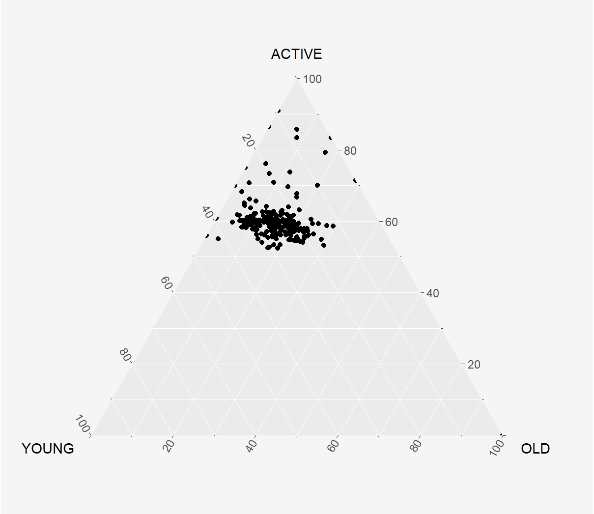
Ternary plots are a way of displaying the distribution and variability of three-part compositional data. (For example, the proportion of aged, economy active and young population or sand, silt, and clay in soil.) It’s display is a triangle with sides scaled from 0 to 1. Each side represents one of the three components. A point is plotted so that a line drawn perpendicular from the point to each leg of the triangle intersect at the component values of the point.
In this hands-on, you will learn how to build ternary plot programmatically using R for visualising and analysing population structure of Singapore.
The hands-on exercise consists of four steps:
- Install and launch tidyverse and ggtern packages.
- Derive three new measures using mutate() function of dplyr package.
- Build a static ternary plot using ggtern() function of ggtern package.
- Build an interactive ternary plot using plot-ly() function of Plotly R package.
2 Getting Starting
For this exercise, two main R packages will be used in this hands-on exercise, they are:
- ggtern, a ggplot extension specially designed to plot ternary diagrams. The package will be used to plot static ternary plots.
- Plotly R, an R package for creating interactive web-based graphs via plotly’s JavaScript graphing library, plotly.js . The plotly R libary contains the ggplotly function, which will convert ggplot2 figures into a Plotly object.
The original data is obtained from Singapore Residents by Planning AreaSubzone, Age Group, Sex and Type of Dwelling, June 2000-2018 off the Singstat website.
The dataset has been downloaded as respopagsex2000to2018_tidy.csv, in CSV file format for this hands-on exercise, courtesy of Prof. Kam.
#Reading the data into R environment
pop_data <- read_csv("data/respopagsex2000to2018_tidy.csv")
Note that Year is in numeric data type, and should be converted into character instead.
The code chunk below performs the following functions:
as.character()to correct Year into character data type- spread() to “spread” a key-value pair across multiple columns (this feels like a quicker version of
pivot_wider!)- Syntax:
spread(data, key value) - where:
- data: Name of the data frame
- key: Column whose values will become variable names
- value: Column where values will fill under new variables created from key
- Syntax:
mutate()function of dplyr package to derive three new measures, namely: young, active, and old
#Deriving the young, economy active and old measures

agpop_mutated <- pop_data %>%
  mutate(`Year` = as.character(Year)) %>%
  spread(AG, Population) %>%
  mutate(YOUNG = rowSums(.[4:8])) %>%        #<< Ages 0-24
  mutate(ACTIVE = rowSums(.[9:16]))  %>%     #<< Ages 25-64
  mutate(OLD = rowSums(.[17:21])) %>%        #<< Above 65
  mutate(TOTAL = rowSums(.[22:24])) %>%
  filter(Year == 2018)%>%
  filter(TOTAL > 0)
Inspecting the output… o.O
glimpse(agpop_mutated)Rows: 234
Columns: 25
$ PA <chr> "Ang Mo Kio", "Ang Mo Kio", "Ang Mo Kio", "Ang Mo Kio", "An…
$ SZ <chr> "Ang Mo Kio Town Centre", "Cheng San", "Chong Boon", "Kebun…
$ Year <chr> "2018", "2018", "2018", "2018", "2018", "2018", "2018", "20…
$ `AGE0-4` <dbl> 180, 1060, 900, 720, 220, 550, 260, 830, 160, 810, 350, 282…
$ `AGE05-9` <dbl> 270, 1080, 900, 850, 310, 630, 340, 930, 160, 1070, 460, 32…
$ `AGE10-14` <dbl> 320, 1080, 1030, 1010, 380, 670, 430, 930, 220, 1300, 490, …
$ `AGE15-19` <dbl> 300, 1260, 1220, 1120, 500, 780, 500, 860, 260, 1450, 400, …
$ `AGE20-24` <dbl> 260, 1400, 1380, 1230, 550, 950, 640, 1020, 350, 1500, 330,…
$ `AGE25-29` <dbl> 300, 1880, 1760, 1460, 500, 1080, 690, 1400, 340, 1590, 310…
$ `AGE30-34` <dbl> 270, 1940, 1830, 1330, 300, 990, 440, 1350, 230, 1390, 310,…
$ `AGE35-39` <dbl> 330, 2300, 1920, 1540, 290, 1100, 400, 1700, 250, 1770, 630…
$ `AGE40-44` <dbl> 430, 2090, 1900, 1700, 420, 1140, 490, 1720, 260, 1860, 810…
$ `AGE45-49` <dbl> 470, 2180, 1910, 1830, 550, 1230, 580, 1530, 320, 2000, 830…
$ `AGE50-54` <dbl> 360, 2160, 2070, 1880, 550, 1350, 640, 1480, 300, 1980, 620…
$ `AGE55-59` <dbl> 310, 2150, 2140, 1810, 560, 1420, 730, 1720, 360, 2010, 460…
$ `AGE60-64` <dbl> 300, 2270, 2170, 1750, 450, 1290, 680, 1680, 350, 1980, 390…
$ `AGE65-69` <dbl> 270, 2130, 2050, 1700, 410, 1150, 500, 1610, 250, 1790, 340…
$ `AGE70-74` <dbl> 190, 1370, 1570, 1240, 290, 830, 280, 1190, 160, 1090, 220,…
$ `AGE75-79` <dbl> 150, 980, 1170, 870, 220, 680, 210, 980, 100, 690, 110, 257…
$ `AGE80-84` <dbl> 60, 560, 640, 540, 140, 360, 180, 560, 70, 390, 80, 1520, 2…
$ AGE85over <dbl> 60, 440, 530, 430, 140, 340, 130, 460, 60, 310, 100, 1350, …
$ YOUNG <dbl> 1330, 5880, 5430, 4930, 1960, 3580, 2170, 4570, 1150, 6130,…
$ ACTIVE <dbl> 2770, 16970, 15700, 13300, 3620, 9600, 4650, 12580, 2410, 1…
$ OLD <dbl> 730, 5480, 5960, 4780, 1200, 3360, 1300, 4800, 640, 4270, 8…
$ TOTAL <dbl> 4830, 28330, 27090, 23010, 6780, 16540, 8120, 21950, 4200, …3 Plotting Ternary Diagram with R
3.1 Plotting a static ternary diagram
Use ggtern() function of ggtern package to create a simple ternary plot.
3.1.1 Basic plot
#Building the static ternary plot
ggtern(data = agpop_mutated,
       aes(x = YOUNG,
           y = ACTIVE,
           z = OLD)) +
  geom_point() +

  theme(
    plot.title = element_text(hjust=0.5, face="bold"),
    #panel.background = element_rect(fill = '#f5f5f5', color = '#f5f5f5'),
    legend.background = element_rect(colour = "#f5f5f5", fill = "#f5f5f5"),
    plot.background = element_rect(fill="#f5f5f5",colour="#f5f5f5") ,
) 
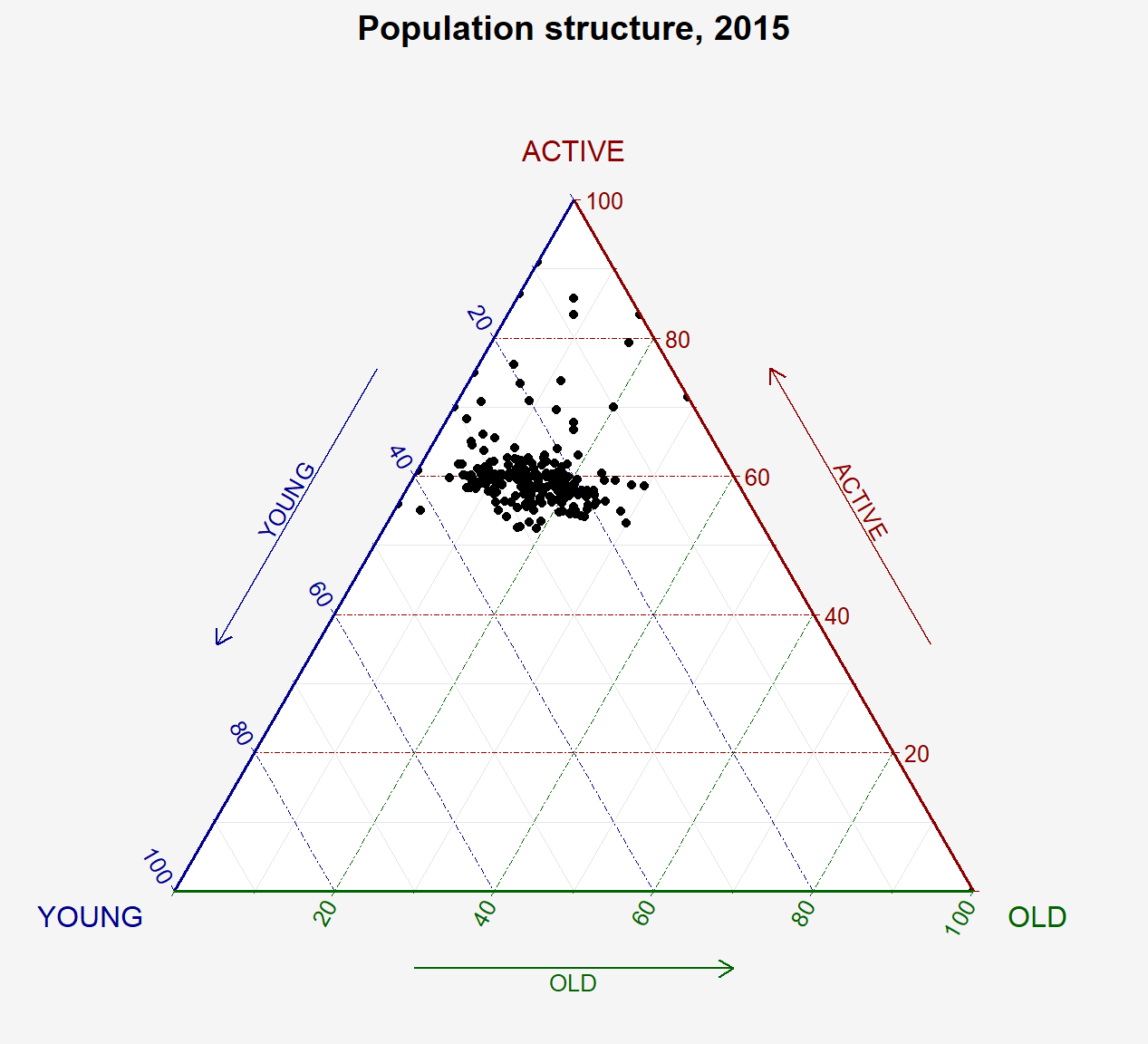
3.1.2 Adding colour and title
#Building the static ternary plot
ggtern(data = agpop_mutated,
       aes(x = YOUNG,
           y = ACTIVE,
           z = OLD)) +
  geom_point() +
  labs(title="Population structure, 2015") +
  theme_rgbw() +

  theme(
    plot.title = element_text(hjust=0.5, face="bold"),
    #panel.background = element_rect(fill = '#f5f5f5', color = '#f5f5f5'),
    legend.background = element_rect(colour = "#f5f5f5", fill = "#f5f5f5"),
    plot.background = element_rect(fill="#f5f5f5",colour="#f5f5f5") ,
) 
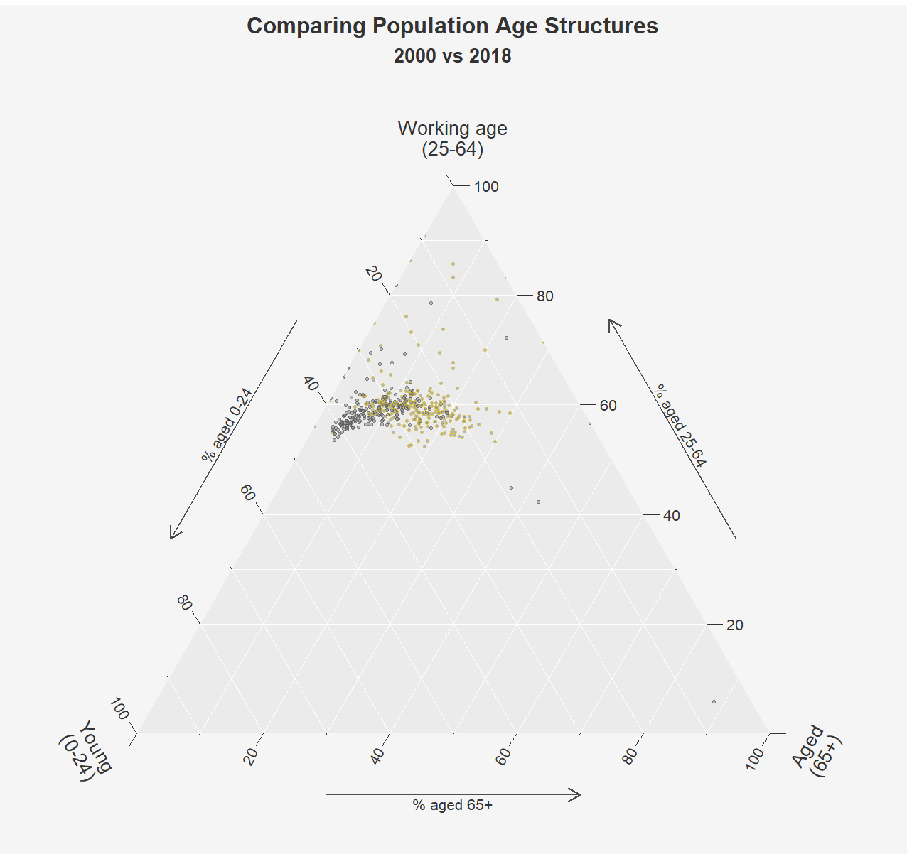
3.1.3 Plotting 2 groups in a ternary diagram & trying out Tricolore package
Instead of ploting 2 regions like the original design, I’ll try to plot with data from 2000 and 2018 so I can compare the changes. The only difference in the data manipulation is added another year in the filter() function:
## Data Manipulation

agpop_mutated2 <- pop_data %>%
  mutate(`Year` = as.character(Year)) %>%
  spread(AG, Population) %>%
  mutate(YOUNG = rowSums(.[4:8])) %>%        #<< Ages 0-24
  mutate(ACTIVE = rowSums(.[9:16]))  %>%     #<< Ages 25-64
  mutate(OLD = rowSums(.[17:21])) %>%        #<< Above 65
  mutate(TOTAL = rowSums(.[22:24])) %>%
  filter(Year %in% c(2018, 2000))%>%         #<< Difference
  filter(TOTAL > 0)
Loading some additional functions for Tricolore.
Show the code
# Additional functions for Tricolore --------------------------------------

# coordinates and labels for the centered gridlines of a ternary diagram
TernaryCentroidGrid <- function (center) {
    # center percent difference labels
    labels <- seq(-1, 1, 0.1)
    labels <- data.frame(
        L = labels[labels >= -center[1]][1:10],
        T = labels[labels >= -center[2]][1:10],
        R = labels[labels >= -center[3]][1:10]
    )

    # breaks of uncentered grid
    breaks = data.frame(
        L = labels$L + center[1],
        T = labels$T + center[2],
        R = labels$R + center[3]
    )

    list(labels = labels, breaks = breaks)
}

# a function to create zooming limits
zoom_limits <- function(
    # 3-columns data frame. ! Oreder is important: L, R, T
    df,
    # whether to minimize zooming triangle and move the data center
    # or keep the data center at (1/3, 1/3, 1/3)
    keep_center = TRUE,
    # add 1 percentage point margin to avoid cutting the extreme points
    one_pp_margin = FALSE,
    # the default is to calculate average from the provided data
    # though, I leave a possibility to specify custom center
    # in our case, custom center is the EU pop structure
    center = apply(df, 2, mean, na.rm = T)
) {
    # calculate minimums of the variables
    mins <- apply(df, 2, min)
    # calculate max data span
    span <- max(apply(df, 2, function(x) diff(range(x))))
    # add 1 percentage point margin to avoid cutting the extreme points
    if(one_pp_margin == TRUE & min(mins) > .01){
        mins <- mins - .01
        span <- span + .01
    }
    # keep the center at (1/3, 1/3, 1/3) or not
    if(keep_center == TRUE){
        limits <- rbind(
            center - (1/3)*span/(sqrt(2)/2),
            center + (2/3)*span/(sqrt(2)/2)
        )
    } else {
        limits <- rbind(
            mins,
            c(
                1 - (mins[2] + mins[3]),
                1 - (mins[1] + mins[3]),
                1 - (mins[1] + mins[2])
            )
        )
    }
    return(limits)
}
Adding ternary colours hexcodes as a column in our dataset:
Show the code
# Whole data mean
center <- agpop_mutated2 %>%
    select("YOUNG", "ACTIVE", "OLD") %>%
    summarise_all(.funs = funs(mean)) %>%
    gather() %>%
  pull(value)

# calculate TRUE scaling factor for colors, i.e. the factor of proportionality
# from big tern to zoomed tern
mins <- apply(agpop_mutated2 %>%
                select("YOUNG", "ACTIVE", "OLD"),
              2,
              min)

zommed_side <- (1 - (mins[2] + mins[3])) - mins[1]
true_scale <- 1 / zommed_side

tric <- Tricolore(
    agpop_mutated2, p1 = 'YOUNG', p2 = 'ACTIVE', p3 = 'OLD',
    center = NA, show_data = FALSE, spread = true_scale,
    contrast = .5, lightness = 1, chroma = 1, hue = 2/12,
    breaks = 20,
    crop = TRUE, label_as = "pct_diff"
)

agpop_mutated2$hex <- tric$rgb

# percent-point difference grid
legend_grid <- TernaryCentroidGrid(center)

# legend limits
legend_limits <- zoom_limits(
    df = agpop_mutated2 %>%
      select("YOUNG", "ACTIVE", "OLD"),
    keep_center = FALSE,
    one_pp_margin = TRUE
) # try playing with the params
Plotting for Year 2000:
Show the code
tric$key +
    geom_point(data = agpop_mutated2 %>% filter(Year == "2000"), aes(YOUNG, ACTIVE, z = OLD),
               shape = 21, fill = "grey50", size = .5, alpha = .5)+
    geom_point(data = tibble(YOUNG = center[1], ACTIVE = center[2], OLD = center[3]),
               aes(YOUNG, ACTIVE, z = OLD),
               shape = 43, color = "white", size = 5)+
    scale_L_continuous(NULL, limits = legend_limits[,1]) +
    scale_T_continuous(NULL, limits = legend_limits[,2]) +
    scale_R_continuous(NULL, limits = legend_limits[,3]) +
    theme_classic() +
    theme(plot.background = element_rect(fill = "#f5f5f5", colour = "#f5f5f5"),
          text = element_text(size = 10, color = "grey20"))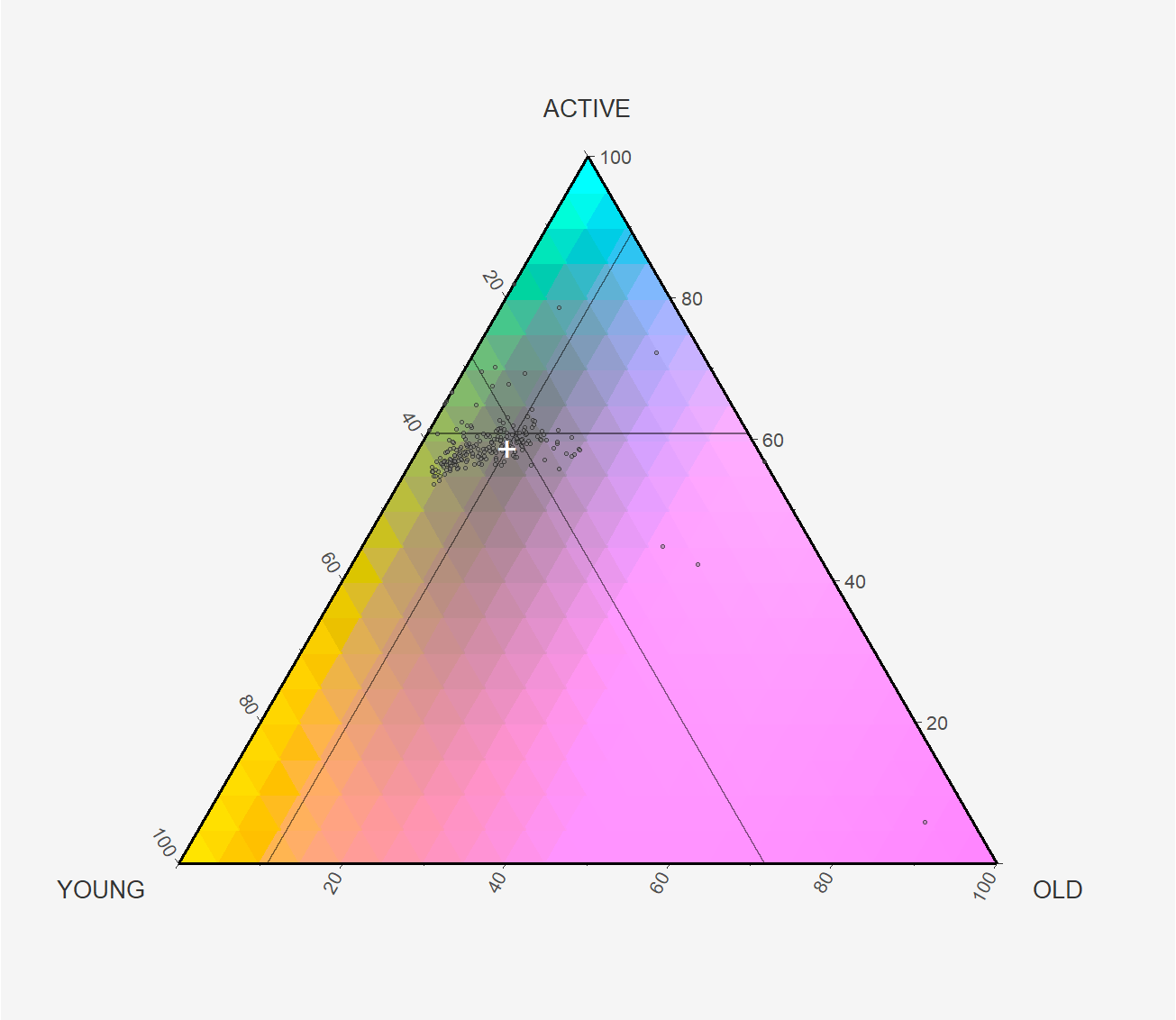
Plotting for Year 2018:
Show the code
tric$key +
    geom_point(data = agpop_mutated2 %>% filter(Year == "2018"), aes(YOUNG, ACTIVE, z = OLD),
               shape = 21, fill = "white", size = .5, alpha = .5)+
    geom_point(data = tibble(YOUNG = center[1], ACTIVE = center[2], OLD = center[3]),
               aes(YOUNG, ACTIVE, z = OLD),
               shape = 43, color = "white", size = 5)+
    scale_L_continuous(NULL, limits = legend_limits[,1]) +
    scale_T_continuous(NULL, limits = legend_limits[,2]) +
    scale_R_continuous(NULL, limits = legend_limits[,3]) +
    theme_classic() +
    theme(plot.background = element_rect(fill = "#f5f5f5", colour = "#f5f5f5"),
          text = element_text(size = 10, color = "grey20"))
Show the code
agpop_mutated2 %>%
    ggtern(aes(x = YOUNG,
               y = ACTIVE,
               z = OLD,
               color= Year))+
    geom_point(shape = 21, fill = "grey50", size = .5, alpha = .5)+

    # For arrows
    scale_L_continuous("Young\n(0-24)", ) +
    scale_T_continuous("Working age\n(25-64)", ) +
    scale_R_continuous("Aged\n(65+)", )+
    geom_mean_ellipse(size = 1)+
    scale_color_manual(values = c("grey25", "gold"))+
    labs(x = NULL, y = NULL,
         title="Comparing Population Age Structures",
         subtitles="2000 vs 2018")+
    Larrowlab("% aged 0-24") +
    Tarrowlab("% aged 25-64") +
    Rarrowlab("% aged 65+") +
    theme(tern.axis.arrow.show = TRUE,
          tern.axis.ticks.length.major = unit(9, "pt"),
          tern.axis.text = element_text(size = 8, colour = "grey20"),
          tern.axis.title.T = element_text(),
          tern.axis.title.L = element_text(hjust = 0.2, vjust = 0.7, angle = -60),
          tern.axis.title.R = element_text(hjust = 0.8, vjust = 0.6, angle = 60),
          text = element_text(size = 10, color = "grey20"),
          legend.position = "none",
          plot.title = element_text(hjust=0.5, face="bold"),
          plot.subtitle = element_text(hjust=0.5, face="bold"),
          plot.background = element_rect(fill="#f5f5f5",colour="#f5f5f5") ,
)
3.2 Interative ternary diagram with plot_ly
The code below create an interactive ternary plot using plot_ly() function of Plotly.
In the code chunk below, argument type = scatterternary. Instead of specifying the x and y axes, we specify a, b and c, set to % Young, % Active and % Old respectively. In the second example, the size of the bubble represents the total population in the subzone while the subzones are colored by Planning Region.
Show the code
# reusable function for creating annotation object
label <- function(txt) {
  list(
    text = txt,
    x = 0.1, y = 1,
    ax = 0, ay = 0,
    xref = "paper", yref = "paper",
    align = "center",
    font = list(family = "serif", size = 15, color = "white"),
    bgcolor = "#b3b3b3", bordercolor = "black", borderwidth = 2
  )
}

# reusable function for axis formatting
axis <- function(txt) {
  list(
    title = txt, tickformat = ".0%", tickfont = list(size = 10)
  )
}

ternaryAxes <- list(
  aaxis = axis("Young"),
  baxis = axis("Economically Active"),
  caxis = axis("Aged")
)

# Initiating a plotly visualization
plot_ly(
  agpop_mutated,
  a = ~YOUNG,
  b = ~ACTIVE,
  c = ~OLD,
  color = I("black"),
  type = "scatterternary"
) %>%
  layout(
    annotations = label("Ternary Markers"),
    ternary = ternaryAxes
  )
3.3 Animated Ternary Plot
3.3.1 Using gganimate (WIP)
The section below attempts to create a animated ternary plot using gganimate(), but it seems like there is some problem getting ggtern to work with gganimate.
## Data Manipulation

agpop_mutated3 <- pop_data %>%
  #mutate(`Year` = as.character(Year)) %>%
  spread(AG, Population) %>%
  mutate(YOUNG = rowSums(.[4:8])) %>%        #<< Ages 0-24
  mutate(ACTIVE = rowSums(.[9:16]))  %>%     #<< Ages 25-64
  mutate(OLD = rowSums(.[17:21])) %>%        #<< Above 65
  mutate(TOTAL = rowSums(.[22:24])) %>%
  #filter(Year >= 2010 & Year <= 2018) %>%
  filter(TOTAL > 0)
Show the code
td2 <- ggtern(data = agpop_mutated3,
           aes(x = YOUNG,
               y = ACTIVE,
               z = OLD,
               size = TOTAL,
               color= PA))+

   geom_point(alpha =0.7,
              show.legend=FALSE)+

   scale_color_viridis_d(option="plasma")+
   scale_size(range= c(2,15)) +

    # For arrows
    scale_L_continuous("Young\n(0-24)", ) +
    scale_T_continuous("Working age\n(25-64)", ) +
    scale_R_continuous("Aged\n(65+)", )+

    labs(title="Comparing Population Age Structures from 2000 to 2018",
         subtitles='Year: {frame_time}')+

    Larrowlab("% aged 0-24") +
    Tarrowlab("% aged 25-64") +
    Rarrowlab("% aged 65+") +

    theme(tern.axis.arrow.show = TRUE,
          tern.axis.ticks.length.major = unit(9, "pt"),
          tern.axis.text = element_text(size = 8, colour = "grey20"),
          tern.axis.title.T = element_text(),
          tern.axis.title.L = element_text(hjust = 0.2, vjust = 0.7, angle = -60),
          tern.axis.title.R = element_text(hjust = 0.8, vjust = 0.6, angle = 60),
          text = element_text(size = 10, color = "grey20"),
          legend.position = "none",
          plot.title = element_text(hjust=0.5, face="bold"),
          plot.subtitle = element_text(hjust=0.5, face="bold"),
          plot.background = element_rect(fill="#f5f5f5",colour="#f5f5f5") ,
)

td2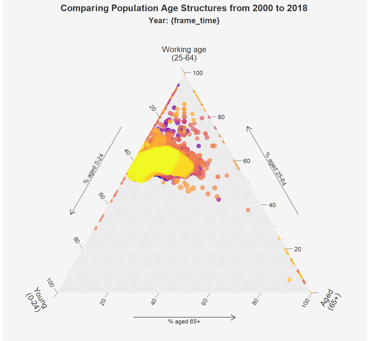
Show the code
#  transition_time(Year) +
#  ease_aes("linear")
3.3.2 Using plotly
Show the code
td3 <- plot_ly(agpop_mutated3,
               a=agpop_mutated3$ACTIVE,
               b=agpop_mutated3$YOUNG,
               c=agpop_mutated3$OLD,
                    frame = agpop_mutated3$Year,
                    mode = 'markers',
                    size = agpop_mutated3$TOTAL,
                    color = agpop_mutated3$PA,
                    type = "scatterternary",
                    text = ~paste('Young:',sep='', YOUNG,
                                  '<br>Economically Active:', ACTIVE,
                                  '<br>Aged:',OLD,
                                  '<br>Subzone:', SZ, hoverinfo="text",
                                  '<br>Planning Area:', PA),
                    marker = list(symbol = 'circle', opacity=0.8,
                                  sizemode="diameter",sizeref=2,
                                  line = list(width = 2, color = '#FFFFFF'))) %>%
                    layout(
                            title = 'Demographic Composition of Singapore',
                            ternary=list(aaxis=list(title="Economically Active"),
                                         baxis = list(title="Young"),
                                         caxis = list(title="Aged")),
                            paper_bgcolor = '#f5f5f5',
                            plot_bgcolor = '#f5f5f5',
                            autosize = FALSE,
                            automargin = FALSE,
                            margin = list(l=50,r=50,b=100,t=100,pad=4),
                            width = 600,
                            height = 500)
td3
4 Reference
- Kam, T.S. (2023). Creating Ternary Plot with R.